Choosing your brand’s colors seems like an easy feat, but in reality, the process can be challenging. Will you be using a color system? Without one, you might choose a blue that looks perfect in your website’s logo, but once you print it on a physical medium, it seems green and completely different.
Read on to learn how Pantone Colors can help you build a consistent brand for your business. In this guide, you’ll learn what Pantone colors are, why you should use them, how to use them, and so much more. Set your brand up for success with a powerful Pantone palette!
What Is the Pantone Color System?
The Pantone Color System is a standard language for color communication, originally conceived in the 1960s by Lawrence Herbert, founder of the Pantone company. It offers a unique naming system for colors, allowing for precise matches and consistent color reproduction across different mediums.
Various industries and professionals who require accurate color coordination and consistency, such as designers, manufacturers, and marketers, predominantly use this system. For instance, a fashion designer might use Pantone colors to ensure their garments maintain the same rich hue regardless of the batch or supplier.
Why Should You Use Pantone Colors for Branding?
Using the Pantone Color System for your brand garners myriad benefits, all of which can significantly contribute to the overall consistency and success of your business.
Precision and Consistency
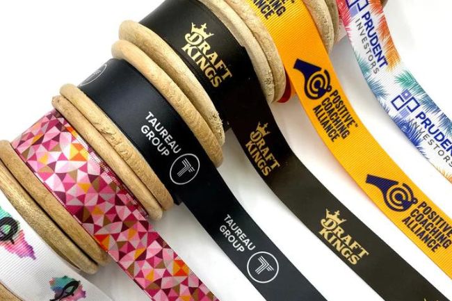
Pantone provides a standardized color system that ensures you accurately replicate the colors you select across all mediums, whether it’s your website or a roll of custom grosgrain ribbon. This precision promotes color consistency, reinforcing brand recognition among your customers.
Extensive Color Palette
With an expansive and constantly growing collection of over 1,800 colors, Pantone allows you the freedom to choose distinctive colors that truly represent your brand and make it stand out in the market.
Global Recognition
Businesses and industries worldwide recognize and use Pantone colors, providing a universally understood color language. Your supplier will know precisely what hue you’re referring to when you mention a Pantone color, whether they have offices locally or abroad.
Dependability
Pantone produces their colors with the highest standards of quality control, ensuring the color you choose today will be the same even years down the line. This dependability saves your business from potential rebranding costs due to color discrepancies.
Embracing the Pantone Color System truly denotes an investment in your brand’s future. Not only does it guarantee color consistency, but it also increases your brand’s recognition, its unique identity, and its longevity.
How To Use These Colors Throughout Your Brand
Implementing Pantone colors throughout your brand is a multifaceted process that extends beyond your logo. Here are a few ways you can leverage this powerful color system.
Marketing Materials
You can use Pantone in marketing materials like business cards, flyers, and even social media graphics. Let’s say you’re releasing a new product line highlighted by Pantone’s “Riviera Blue.” Therefore, your marketing materials should reflect this primary color to create a cohesive brand image.
Product Design
Use Pantone colors in your product design to ensure uniformity in the look and feel of your offerings. If your brand identity includes Pantone’s “Rose Quartz,” ensure you use this color consistently, whether in your product’s packaging or the ribbon adorning it.
Physical Locations
Apply your brand’s Pantone colors to your physical locations, such as offices, stores, or event booths. Doing so helps to create a visually coherent environment that customers can associate with your brand. Imagine entering a store and immediately recognizing the brand by the “Blazing Yellow” Pantone color used in the store layout and decor.
Website and Digital Platforms
Your digital presence should reflect your brand’s Pantone colors. Every detail matters, from your website’s color scheme to the color of the call-to-action buttons. Use “Greenery” consistently across your digital platforms to reinforce your brand identity if it’s part of your brand’s Pantone palette.
Remember, the goal is to create a cohesive visual brand identity that resonates with your customers and differentiates you from the competition. Every time a customer sees your marketing materials, visits your store, uses your product, or interacts with your digital platforms, they should experience the same visual identity.
How To Find the Ideal Colors for Your Brand
Finding the ideal colors for your brand involves a careful and thoughtful process. It’s not just about choosing colors you like but rather about selecting hues that effectively convey your brand’s personality and resonate with your target audience. With the Pantone Color System, this process becomes easier and more precise.
Start by understanding your brand’s personality. Are you a luxury brand? Perhaps a deep and bold Pantone color like “Majestic Purple” would suit. Or maybe you’re a health-conscious brand, so a vibrant and fresh hue like “Greenery” might be more appropriate.
Next, consider your audience’s preferences. Research shows that different demographics respond favorably to different colors. For example, younger audiences might prefer brighter, bolder colors, while older audiences may lean towards more muted, sophisticated tones.
Finally, don’t forget to consider color psychology. Different colors can evoke different emotions and reactions. For example, many associate red with passion and urgency, while they often associate blue with trust and stability.
By leveraging the Pantone Color System and aligning your color choices with your brand’s personality, audience preferences, and color psychology, you can create a visually compelling and cohesive brand identity that sets you apart in the market.
Successful Pantone-Powered Brands for Inspiration
Here are a few brands that have harnessed the power of Pantone colors to create memorable and distinctive identities to inspire you as you embark on your color selection journey:
Tiffany & Co.
The luxury jewelry brand is synonymous with its distinctive “Tiffany Blue” box, a custom color that Pantone now recognizes as “PMS 1837.” This unique shade of robin egg blue, a well-guarded trademark, has enhanced brand recognition and added a consistent, luxurious touch to the brand’s packaging.
Starbucks
Known for its Pantone “3425C” green shade the brand uses across all branding elements. The color consistency resonates with customers and assures them of the same great taste, whether they’re in Seattle or Singapore.
Using Pantone colors, these brands have created an unmistakable visual identity that resonates with their customers globally. Their successful implementation of Pantone colors is an inspirational example of how color can build a consistent and compelling brand.
Color is not merely a design element but a powerful communication tool that resonates deeply with audiences. Color can influence perceptions and drive engagement. Therefore, you must choose your brand colors wisely to help you create beautiful visuals and meaningful connections.
Pantone colors can help you build a consistent brand with its comprehensive color palette backed by precision and global recognition. Let your brand shine in its true colors and weave your narrative in every touchpoint throughout your business. Step into the vibrant world of Pantone and let color be the thread that ties your brand together.
